• projects.
    • neon space moon.
    • the shape of refractive memory.
  • places.
    • new york.
    • bali.
    • paris.
    • los angeles.
    • australia.
    • japan.
    • sedona.
    • england.
  • people.
    • sports.
    • portraits.
    • events.
  • things.
    • wildlife.
  • itp blog.
    • itp_general.
    • itp_icm_f18.
    • itp_physical computing_f18.
    • itp_video&sound_f18.
    • itp_visual language_f18.
    • itp_animation_f18.
    • itp_wearables_s19
    • itp_fandom_s19
    • itp_turning_s19
    • itp_uxdesign_s19
    • itp_fungus_s19
    • itp_softrobotics_s19
    • itp_augmentedreality_f19
    • itp_fabrication_f19
    • itp_light&interactivity_s20
  • connect with me.
  • Menu

Madshutter Photo

  • projects.
    • neon space moon.
    • the shape of refractive memory.
  • places.
    • new york.
    • bali.
    • paris.
    • los angeles.
    • australia.
    • japan.
    • sedona.
    • england.
  • people.
    • sports.
    • portraits.
    • events.
  • things.
    • wildlife.
  • itp blog.
    • itp_general.
    • itp_icm_f18.
    • itp_physical computing_f18.
    • itp_video&sound_f18.
    • itp_visual language_f18.
    • itp_animation_f18.
    • itp_wearables_s19
    • itp_fandom_s19
    • itp_turning_s19
    • itp_uxdesign_s19
    • itp_fungus_s19
    • itp_softrobotics_s19
    • itp_augmentedreality_f19
    • itp_fabrication_f19
    • itp_light&interactivity_s20
  • connect with me.
IMAGE.JPG

Week Six Assignment | Business Card

October 18, 2018

This week we were assigned to create business cards for ourselves.  I went with a less traditional method and decided to use plastic as a medium and use the laser cutter to rasterize and cuts. I used prototype and quantum fonts (found though dafont.com) and used my LED drawing from the poster. The nounproject was my source for the mobile phone, web, and mail icons.

I found the process of design to be incredibly fun, yet found the production was a bit difficult to master in the short amount of time I provided.  The materials chosen were a thin laser cuttable luminescent plastic.  I underestimated the cut and lost part of the design during printing. 

Below are screenshots of the process in illustrator and during the laser cutting process. 

Screen Shot 2018-10-18 at 2.23.10 PM.png Screen Shot 2018-10-18 at 2.23.18 PM.png IMG_3368.JPG IMG_1753.JPG IMG_4855.JPG IMG_3632.JPG IMG_1758.JPG IMG_1759.JPG


Comment
2018 ITP Winter Show Poster Submission

2018 ITP Winter Show Poster Submission

Week Five Assignment | Composition

October 11, 2018
Untitled-2-02.png

This week our assignment was to create a poster for the upcoming Winter Show for the program this December. When thinking out the design and composition, I wanted to tell a story that intertwined the experiences that the winter show will bring.

With story telling, the most common form of content we ingest is that of film — it’s an older medium, yet it still ranks the charts of popularity and really is the vehicle behind creating a visual story. At ITP, we’re taught to tell stories though other mediums. The LED strip is purposely similar to that of film and indicates the beginning of the story of telling a story of ICM and Physical Computing, while displaying in other mediums, such as mobile and VR.

I chose a simple color theme based off of NYU’s main color and chose to keep the other colors within the same hue of NYU purple. The design is purposely composed to drag the viewer’s eyes around the poster, with the focal point the title (winter show 2018) and getting further details when exploring though the canvas.

x.

Comment
Color Palette

Color Palette

Week Four Assignment | Color Palette

October 04, 2018

This week we were asked to choose a color palette that represents us and to make six compositions within a square shape using the same palette. I decided to use RGB and selected black | 000000, grey | 9994a1 (with a violet hue), violet | 8a20c5 , lime green | 90e470, and a grey-ish blue | 4293c2. I made a few shapes in illustrator and created the following images. Presentation slides here.

grey.

grey.

green.

green.

violet.

violet.

blue.
black.

black.

brooklyn bridge.

brooklyn bridge.

The last image was created using a technique in Illustrator called ‘Image Trace’. Below is the step-by-step in how I achieved the above.

image to image trace with six colors.

image to image trace with six colors.

Comment
Airline Boarding Pass Redesign

Airline Boarding Pass Redesign

Week Three Assignment | Typography & Expression

September 27, 2018

This week we were challenged to redesign a boarding pass as well as designing 3 words as images. I found this assignment rewarding in the challenge and enjoyed it very much!

For the boarding pass, I wanted to make sure that all key elements of information were visible and easy to understand while not loosing the form factor of the existing boarding pass. I think I achieved this by focusing on making important data points larger and easier to read/understand.

For the creative text portion of the assignment, I focused on nature, as the primary element for words and art. I chose fire, leaf, and tree to create artistic text. For the fire element, I put the word ‘Fire’ in a flame and made dot of the ‘i’ a flame as well. For the Tree, i used an image of the tree to institute the ‘T’ and also added branches to the ‘r’ and two ‘e’s. For the ‘Leaf’ I also used the leaf as the ‘L’ and made some vein cuts in the letters as well. Images below.

Presentation link here.

x.

WordsAsImages-04.png
WordsAsImages-03.png
WordsAsImages-02.png

Fire, Tree, & Leaf as Creative Text.

Comment
IMG_1483.JPG
IMG_1526.JPG
IMG_1488.JPG
IMG_1487.JPG

Week Two Assignment | Signage Research

September 19, 2018

The above block shows (2) Successful Signage Examples & (2) Unsuccessful Signage Examples that I found in Brooklyn, Manhattan, and New Jersey this past week.

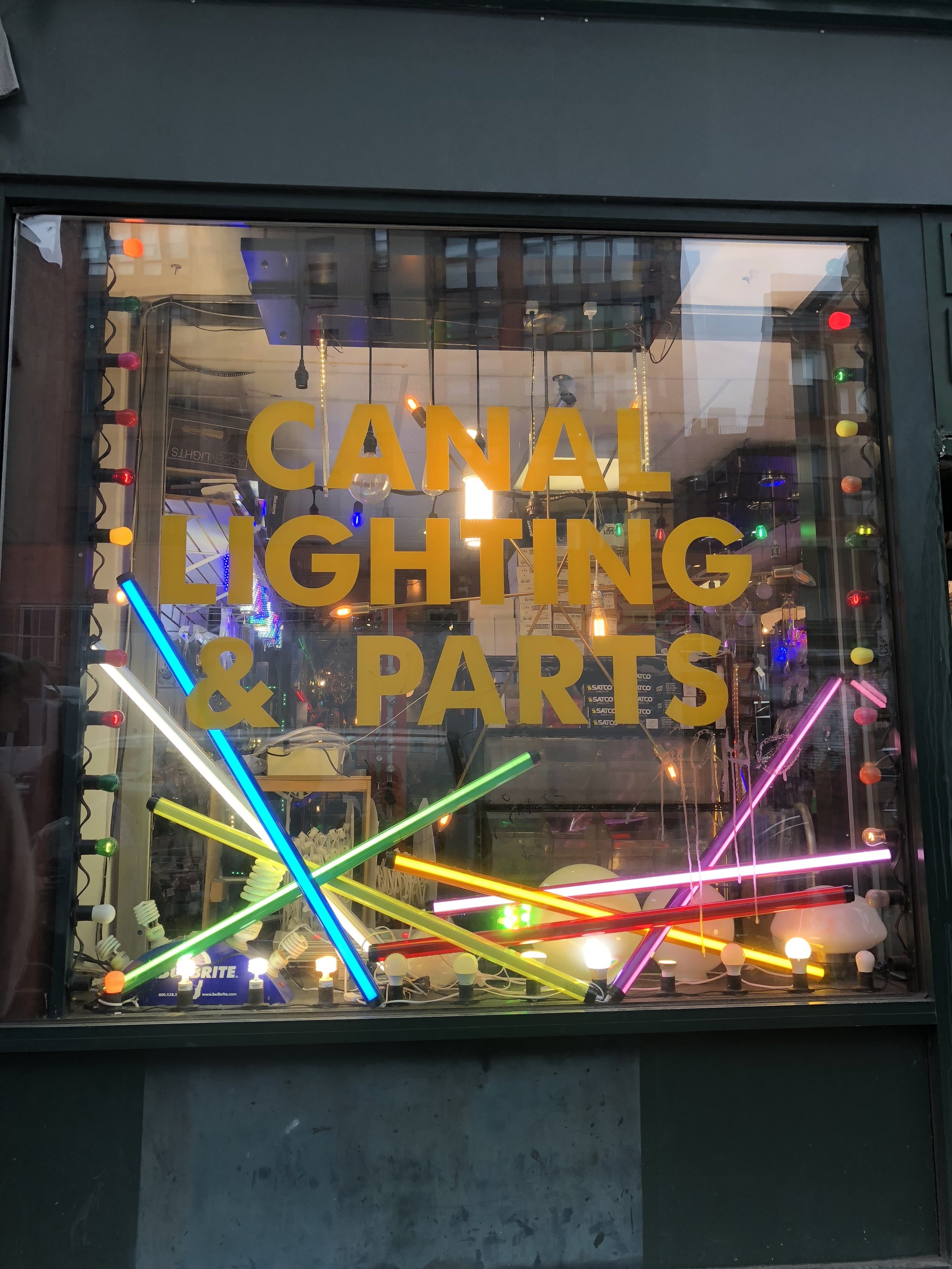
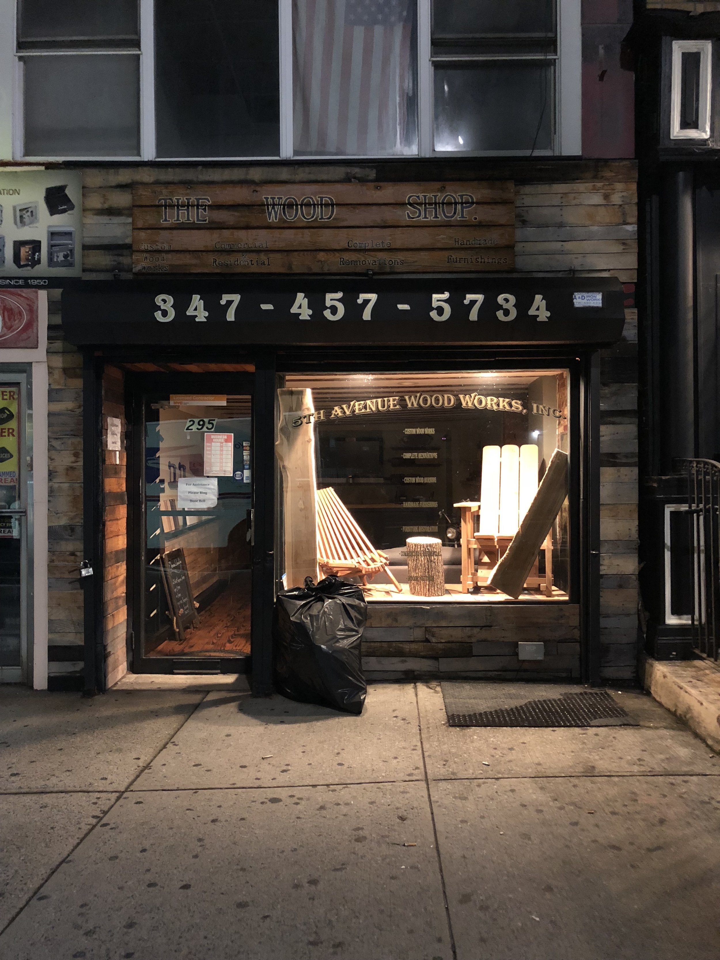
Both successful signage examples show the products though their windows with limited yet direct typography that supports the information (or products) that are presented. I especially enjoy this aesthetic and approach to shop signage, depicting what is actually being sold in the storefront. The Canal Lighting Parts sign is located in Manhattan, NY and the 5th Avenue Wood Works sign is located in Brooklyn, NY.

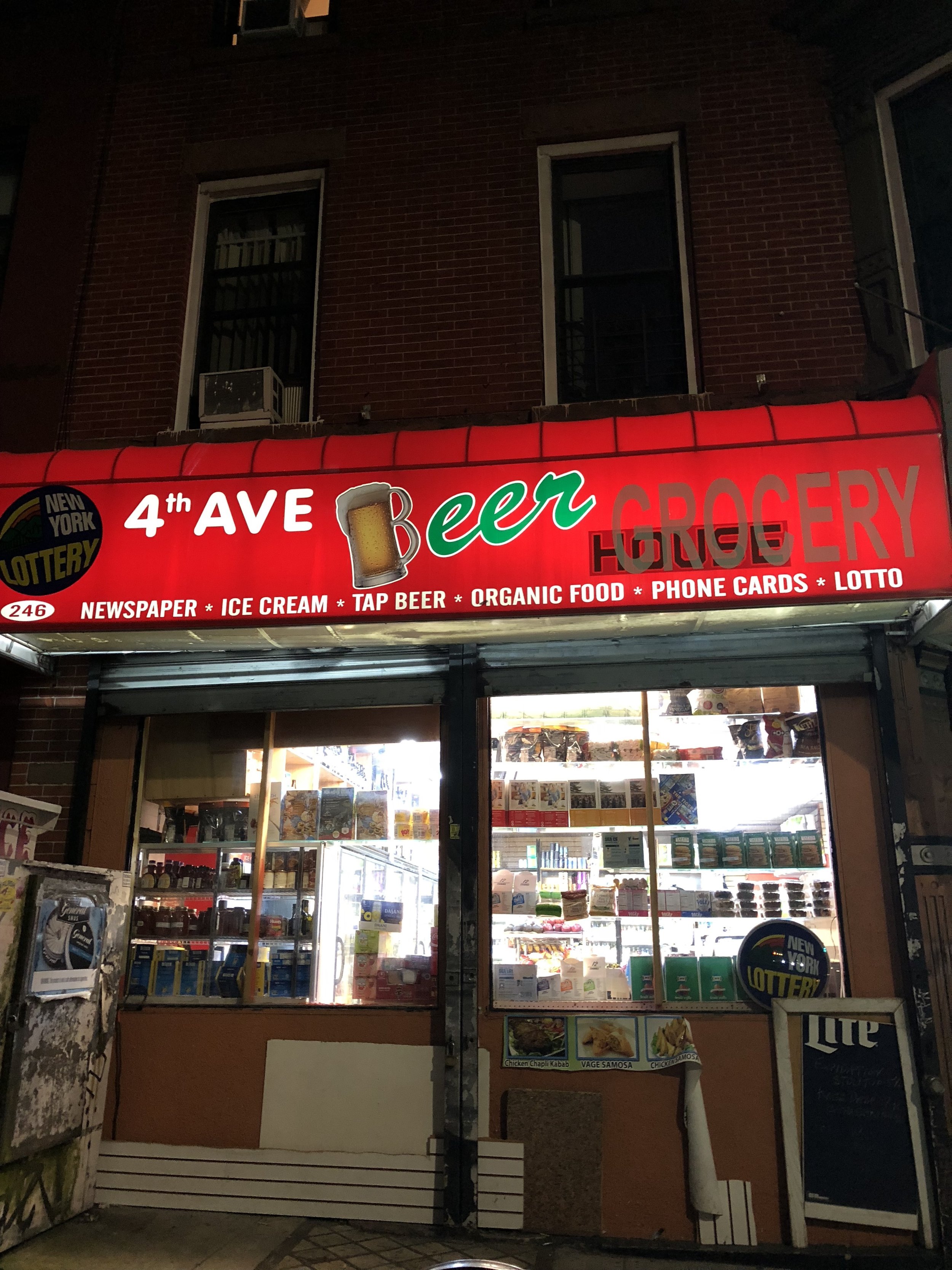
The ‘4th Avenue Beer Grocery’ signage is very busy and could be simply adjusted to just read 4th Avenue Grocery. The Beer signage is separate from the grocery and could indicate an establishment that only serves beer. The 4th Avenue Beer & Grocery sign is located in Brooklyn, Ny.

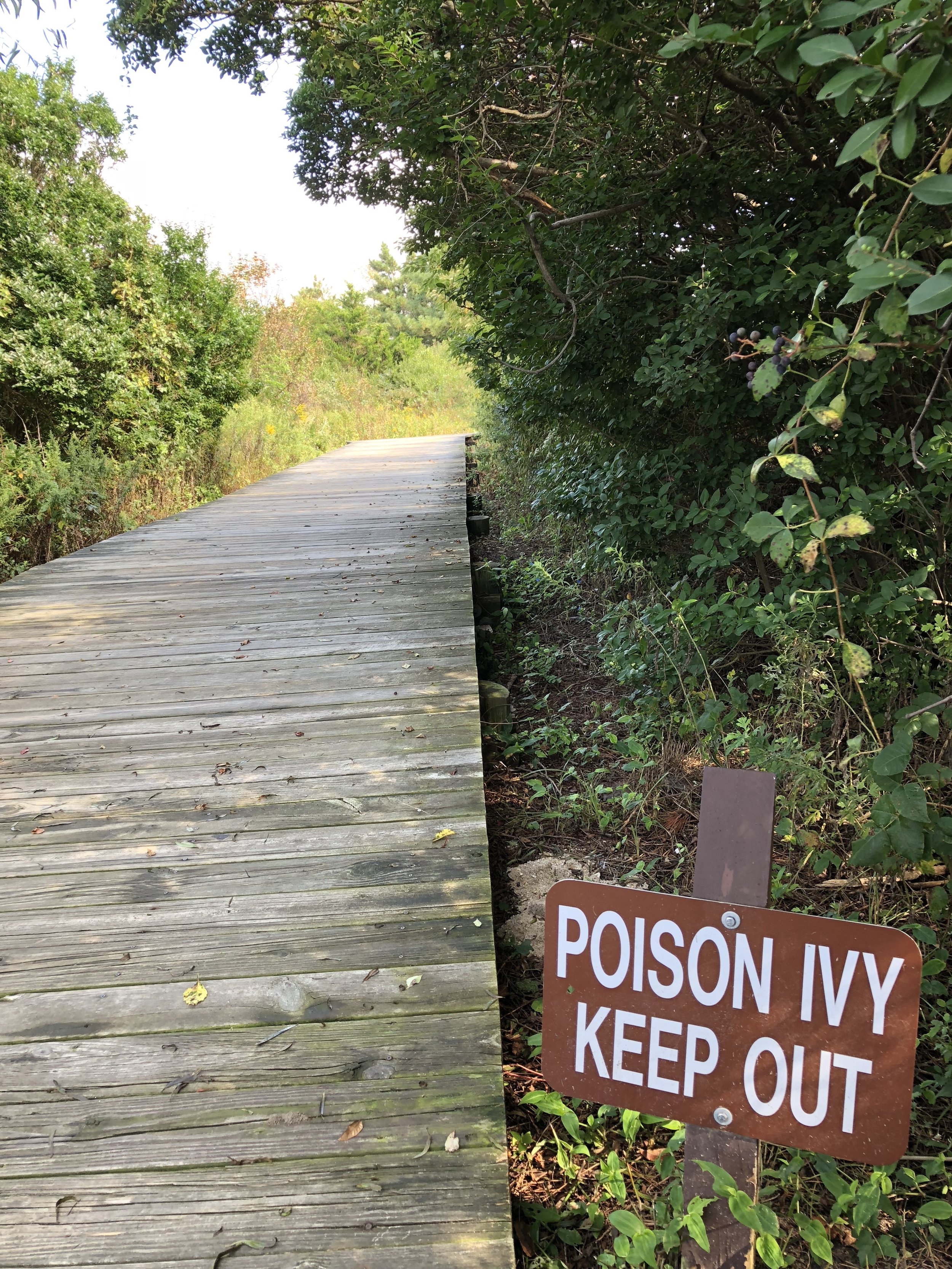
The ‘Poison Ivy Keep Out’ signage is confusing as it is not indicating where to which the poison ivy is exactly, and if one would want to keep off the trail altogether. It is located in a park, adjacent to the beach in Long Branch, NJ. I chose this sign to edit and the challenge would be to instruct as well. I chose to adjust the sign to read ‘Poison Ivy Keep On Trail’. This provides the observer to know that there is poison ivy, but not on the trail as the sign indicates that the trail is to be followed and if one would verve off the trail then there could or would be poison ivy. I used Adobe Photoshop to remove the ‘Keep Out’ and replace with ‘Keep on Trail’.

Photo edited in Photoshop to remove ‘KEEP OUT’ and replace with ‘KEEP ON TRAIL’

Photo edited in Photoshop to remove ‘KEEP OUT’ and replace with ‘KEEP ON TRAIL’

Here is my presentation prepared for class on Thursday, September 20th 2018.

Comment
NEW YORK the WONDER CITY | vintage travel poster print | USA, America

NEW YORK the WONDER CITY | vintage travel poster print | USA, America

Week One Assignment | Design Analysis

September 13, 2018

For this week’s assignment, I chose to use a poster used to promote travel to New York City in the 1930s. I saw this poster at MoMA this past weekend and decided to use this for my project analysis this week. I really enjoyed the use of color/white space, and also the depth of field illusion created by the illustration.

The buildings juxtaposed are the Rockefeller Center, Manhattan Bridge, and the Empire State Building. All within blocks from each other, these tourist destinations are not relatively close in the manner in which they are displayed. This poster promotes all the wonders of Manhattan during the 1930s and was most likely incredibly successful.

NEW YORK the WONDER CITY | Grid Analysis

NEW YORK the WONDER CITY | Grid Analysis

I have added a total of 5 grid-lines, which separates the poster in 3 vertical columns and 5 horizontal rows. The 3 vertical columns are created by the three main elements of this poster; The Rockefeller Center; The Manhattan Bridge; and The Empire State Building respectfully. Horizontally, the first row in the grid s created around the typography; secondly, negative space; followed by the Manhattan Bridge again; and closed up with the remaining building structures. It is very clear that the Manhattan Bridge is the centerpiece of this image - as an advertisement to see Manhattan, it really holds the most weight.

NEW YORK the WONDER CITY | Color Analysis

NEW YORK the WONDER CITY | Color Analysis

There were four colors in this poster, all used very effectively. The color red takes up the majority of the image, while the white creamy color is used as light reflecting off the structures. Black is used to show the shadows and pink is a variance in color used to bring depth to the poster. The use of color in this depiction were simple, yet potent - a great eye-catching image to promote tourism, indeed.

NEW YORK the WONDER CITY | Typography Analysis

NEW YORK the WONDER CITY | Typography Analysis

I used a tool called What The Font to analyze the poster and choose the closest fonts to the image. I was pretty amazed by the overall function and close accuracy in finding computer generated typography similar to the hand-drawn characters from the 1930s. Poster Gothic Cond ATF Heavy by ATF Collection is closest to the ‘NEW YORK’ typeface; Fledgling Heavy Italic byTypodermic suffices as the match for ‘the’; and WTC SALUTE by BORUTTA GROUP is almost an exact match for ‘WONDER CITY’.

Overall, I’m a bit blown away by the typography recognition of the What The Font tool — however, I’m also very impressed by the selections. I like the poster because it brings some of the best of what NYC has to offer in one eye-catching, four-color print that communicates the purpose of tourism clearly and inspires those who are curious to travel to NEW YORK the WONDER CITY.

Comment

Donec sed odio dui.

Vestibulum id ligula porta felis euismod semper. Maecenas faucibus mollis interdum. Cum sociis natoque penatibus et magnis dis parturient montes, nascetur ridiculus mus.

Aenean eu leo quam. Pellentesque ornare sem lacinia quam venenatis vestibulum. Curabitur blandit tempus porttitor. Curabitur blandit tempus porttitor. Donec id elit non mi porta gravida at eget metus.

Sed posuere consectetur est at lobortis.

Integer posuere erat a ante venenatis dapibus posuere velit aliquet. Aenean lacinia bibendum nulla sed consectetur. Cras justo odio, dapibus ac facilisis in, egestas eget quam. Vivamus sagittis lacus vel augue laoreet rutrum faucibus dolor auctor. Cras mattis consectetur purus sit amet fermentum. Vivamus sagittis lacus vel augue laoreet rutrum faucibus dolor auctor.​